Our Brand Story
Shifting to CEDAR
Who We Are and Why We Changed Our Name
Julie Guild, Therapist and Julie Knopp, Dietitian have served countless families and individuals together since 2016. In their work, the two often heard parents and individuals say that they did not want to have to send their children away from home or go away for treatment and how helpful it would be to have all providers in one Practice. In 2021 during the pandemic, in response to hospitalizations in teens doubling and an alarming rise in requests for care they felt they needed to move to make their joint dream a reality. The dream was a center that would make it possible for teens and adults to stay at home and in their communities while at the same time ensuring they had every chance at full recovery. It soon became clear that merging this collective passion made all the sense in the world.
As the center formed during 2022, they took great measures to ensure to put together an expertly trained staff of providers all under one roof; Therapists, Dietitians, Coaches and Mentors. They advanced their training in Family Based Treatment (FBT), the gold standard in eating disorder care for teens and Cognitive Behavioral Therapy-Enhanced for Eating Disorders (CBT-E) for adults. Finally, they decided on a new home for the practice in a beautiful, home-like building. This set them up to provide expert care and treat teens and individuals in the RVA community within a comforting outpatient setting.
In 2023 with Julie Guild as acting owner and Director of Richmond Center for Eating Disorders the decision was made to expand services to include anxiety disorders. With the understanding that eating and anxiety disorders often go hand in hand, Julie began to reevaluate the ways the center could best support our community. She strongly felt a name that better describes the offerings was needed. The next step was rebranding and finding a name that reflected what the center was not only offering but the culture and environment providing those services.
Julie drew from many inspirations to construct the new brand, including:
- Giving
- Rejuvenation
- Health
- Overall well-being
- All of our beauty inside
To accomplish this, a single symbol was created that encompassed all of those aspects.
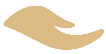
Within the A of CEDAR is a hand reaching out. This signifies a helping hand and is intended to symbolize that we’re here and you don’t have to do this alone. It also means a new beginning. When we grow inside, we begin again in a whole new beautiful way.
The hand is also a flower, which signifies the beauty in life and the beauty within all of us. In many places, we use the symbol in motion to signify rejuvenation and growth and the ongoing lifecycle that nourishment provides.
When brainstorming the new name, the original idea was to combine an anagram and a symbol. An anagram is a word, phrase, or name formed by rearranging the letters of another.
The symbol was a complex undertaking, as we wanted to ensure a dual meaning. It was important that it represented both being regenerative and having connectivity. We are bringing loved ones together to support their suffering one, and we are also giving that person what they need to regenerate. Could we demonstrate togetherness and the regeneration of togetherness with one symbol? This became vital as we considered names.
When evaluating the Cedar Tree, we thought about the idea of suffering but not dying. Of not giving up. Of putting all of one's energy into the next branch. And we contemplated the connectivity that trees have in the woods and in the communities that sustain them. We thought about the connection to one another and the connection to all of nature that surrounds them.
And as this was clearly meant to be, CEDAR was our perfect symbol and worked as an anagram for
Richmond
Center for
Eating and
Anxiety
Disorders.
Here's the transition from our prior logo to our newly refreshed 2024 brand image.
Our goal was to incorporate growth and rejuvenation from the start, so we wanted to maintain those adjectives moving forward in our newly refreshed brand.

